I'm going to spend the next week giving an overview of basically every Kindle feature. I think at the right price it will be in the hands of every book reader (or even Web reader) in the very near feature. If you hate the idea of eBooks, then just ignore me. If not, then read on.
Today, I'll go over the overall look and feel of the device; over the next couple days, I'll show you what the free Internet looks like (yes,
free), and some of the other less talked about features.
The first thing that really struck me about the device was the box; you can tell a lot from a gadget by the amount of time spent in packaging. The box is basically shaped like a book (creative, right!); I put my box on my bookshelf.
When I turned the Kindle on for the first time, it look fake--I didn't think words could ever be so clear on something. It's just like words in a book. When I took it outside there was absolutely no glare.
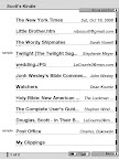
The first thing you see when you turn on the device is the main menu. On this menu you can sort books by title, author, or most recently read/added. You can also choose to show only magazines, newspapers or books. When you stick a 4 gig card into the Kindle, and load it with thousands of books, this main screen becomes problematic...it would be nice to have the option of hiding some of the books; otherwise you'll spend twenty minutes hitting next page to get to the book you want.
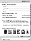
What really separates the Kindle from Sony's reader is the ability to download books without a computer. In less then a minute, you can go to the store, pick the book, and have it downloaded onto your device. And there's a huge amount of books already available (unfortunately, there's not many magazines). You also have the option of previewing as many books as you can fit; the previews usually contain about 20 to 50 pages, which is enough to help you know if the book is worth reading.
Day Two
Day Three
Day Four
Day Five


No comments:
Post a Comment